When it comes to mastering digital identity, few names spark as much intrigue in the design community as Identifier Cards. Originally emerging as a niche Instagram aesthetic page, Identifier Cards has evolved into a powerhouse digital collective that dictates how influencers, musicians, and streetwear brands present their online personas. At lovemebio.com, we constantly analyze top-tier profiles, and the pseudonymous masterminds behind this brand offer a masterclass in mystery, UI design, and bio optimization. But with viral fame comes a wave of confusion. In this deep dive, we tackle the most frequent FAQs and debunk the biggest myths surrounding their approach to personal branding.
Quick Facts: The Identifier Cards Collective
| Attribute | Details |
|---|---|
| Entity Name | Identifier Cards (Design Collective) |
| Founded | 2019 |
| Base | Global / Digital-First |
| Known For | Digital ID aesthetics, Y2K UI, Bio link architecture |
| Primary Handles | @identifiercards (IG/TikTok) |
Social Media Presence & Bio Architecture
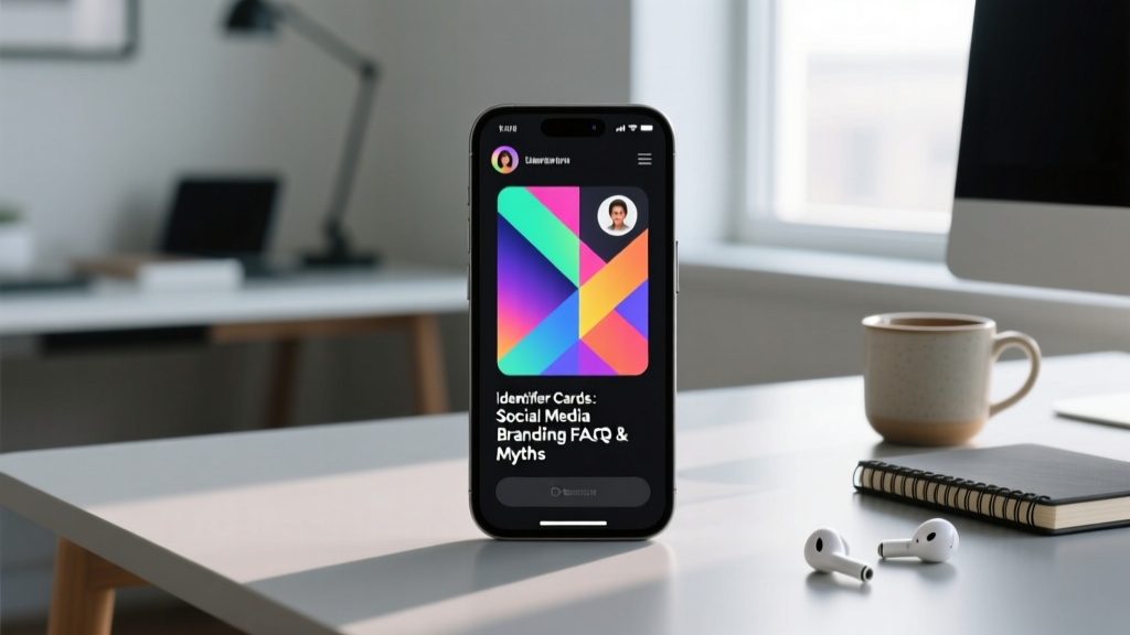
To understand the genius of Identifier Cards, you have to look past their viral grid posts and examine the anatomy of their own social media profiles. On Instagram, their bio is a masterclass in minimalist, terminal-style world-building. Instead of using emojis, which they view as visual clutter, the brand relies on Unicode brackets, monospace fonts, and cryptic geographic coordinates that change weekly to hint at upcoming digital drops or collaborations.
Their link-in-bio is where the true magic happens. While most influencers use standard, pastel-colored Linktree templates, the Identifier Cards portal is designed to mimic a retro-futuristic operating system or a high-security ID scanner. When a user clicks the link, they are greeted with a scanning animation, followed by a dashboard that categorizes their free templates, premium UI kits, and brand consultation forms as classified files. This gamification of the user journey drastically increases dwell time and conversion rates.
Furthermore, their engagement strategy relies heavily on the drop model. Rather than posting daily, they treat every template release like a limited-edition streetwear launch. This scarcity mindset, combined with their enigmatic persona, has cultivated a cult-like following of designers and marketers who eagerly await their next bio-aesthetic innovation. According to digital branding analyses on Behance, this approach to UI-driven personal branding is currently one of the most effective ways to capture the attention of Gen Z and millennial audiences who suffer from standard social media fatigue.
FAQ: Common Misconceptions About Identifier Cards
Because the collective operates with a high degree of anonymity, several myths have circulated across design forums and TikTok comments. Let us separate fact from fiction.
1. Misconception: They are a physical merchandise and printing company.
One of the most frequent questions we receive at lovemebio is whether users can order physical, holographic ID cards from the brand. The truth? Identifier Cards is strictly a digital-first UI/UX and branding collective. The cards they showcase are high-fidelity mockups, digital badges for Discord servers, and aesthetic templates for Instagram highlight covers and link-in-bio landing pages. Their focus is entirely on optimizing your digital footprint, not your physical wallet.
2. Misconception: The aesthetic is exclusively for gamers and crypto brands.
While the Y2K cyberpunk and retro-terminal aesthetics initially gained traction in the Web3 and gaming spaces, Identifier Cards has successfully pivoted to mainstream personal branding. Today, indie musicians, underground streetwear designers, and even boutique PR agencies utilize their digital ID templates to stand out. The aesthetic communicates exclusivity and tech-forward thinking, which translates well across any niche that values cutting-edge visual culture.
3. Misconception: You need advanced coding skills to replicate their bio style.
Many aspiring influencers believe that achieving the Identifier Cards look requires custom CSS or web development. In reality, the collective is famous for democratizing this aesthetic. They leverage no-code platforms like Linktree, Carrd, and Canva, utilizing custom hex codes, monospace typography (like Courier New or Space Mono), and clever use of Unicode symbols to create a terminal or ID scanner vibe directly within standard bio builders.
Personal Branding Takeaways for Your Own Profile
What can everyday users and aspiring creators learn from this digital phenomenon? Here is how you can apply the Identifier Cards philosophy to your own Instagram or TikTok bio.
Treat Your Bio Like a Digital Passport
Instead of writing a generic sentence about your hobbies, structure your bio like a dossier or an ID card. Use vertical lines (|) or bullet points to separate data fields. For example:
STATUS: Creating
LOC: Global
CLEARANCE: Level 5
This instantly transforms a boring bio into an interactive, world-building element that hooks visitors and encourages them to click your links.
Master the Link-in-Bio Architecture
Your link-in-bio should not just be a list of URLs. Take inspiration from how Identifier Cards designs their landing pages. Use a dark mode background, high-contrast neon or monochrome text, and frame your links as system commands or files rather than standard buttons. This increases click-through rates by making the user feel like they are hacking into your personal mainframe, turning a simple click into an immersive experience.
Leverage the Power of Pseudonymity
You do not need to hide your face, but adopting a brand name or a conceptual alias for your creative endeavors can elevate your perceived authority. Identifier Cards sounds like an institution, not just a person. If you are a freelancer or artist, consider branding your profile as a studio or an archive (e.g., The [Your Name] Archive or [Your Name] Visuals) to give your personal brand a larger-than-life, cinematic quality.
Curate Your Visual Hierarchy with Restraint
The most common mistake users make when trying to adopt a cyberpunk or Y2K aesthetic is overloading their profile with glitch effects, neon colors, and chaotic fonts. The brilliance of the Identifier Cards brand lies in its restraint. They typically use a maximum of two colors (often a stark black background with a single accent color like terminal green or warning orange) and one primary monospace font. When updating your own profile, strip away the noise. A clean, highly structured, and minimalist data-driven bio will always outperform a cluttered, chaotic one. Remember, true digital luxury is found in negative space and precise alignment.
Sources & Further Reading
- Instagram UI/UX Trends & Digital Identity Analysis - instagram.com
- Y2K and Cyberpunk Aesthetics in Modern Branding - behance.net
- No-Code Link-in-Bio Optimization Strategies - linktr.ee