When it comes to celebrity offspring navigating the digital landscape, few have executed a pivot as deliberate and striking as Rocco Ritchie. Born into the ultimate global spotlight as the son of Madonna and Guy Ritchie, he could have easily defaulted to the polished, heavily managed influencer route. Instead, Rocco Ritchie chose the path of the underground visual artist. By adopting the pseudonym Rhed and cultivating a gritty, unfiltered social media presence, he has completely rewritten the playbook for legacy personal branding. In this comprehensive deep dive, we analyze his digital footprint, his minimalist bio strategy, and the aesthetic choices that separate his authentic artistic identity from his famous lineage.
Quick Facts: The Artist Behind the Alias
| Attribute | Details |
|---|---|
| Full Name | Rocco John Ritchie |
| Born | August 11, 2000 |
| Nationality | British-American |
| Known For | Visual Art (under alias Rhed), Street Photography |
| Primary IG Handle | @roccoritchie (frequently shifts between public/private) |
| Artistic Alias | Rhed |
| Background | Former dancer on the Rebel Heart Tour; London-based painter |
The Evolution of Rocco Ritchie’s Public Persona
To understand the current state of his social media branding, one must look at the trajectory of his public life. As a child, his digital footprint was entirely managed by his mother, featuring heavily produced tour footage and family portraits. However, his teenage years marked a sharp departure from the pop-culture machine. Following a highly publicized custody transition, he relocated to London to live with his father, filmmaker Guy Ritchie. This geographical and cultural shift catalyzed a complete rebranding of his personal identity.
He stepped away from the choreographed world of stadium tours and immersed himself in the gritty, underground street culture of East London. He picked up a paintbrush, began studying the mechanics of visual art, and eventually adopted the moniker ‘Rhed’. This pseudonym was a strategic masterstroke in personal branding. By divorcing his art from his famous last name, he forced critics, curators, and followers to engage with his work on its own merits. His social media presence evolved in tandem with this artistic awakening, shifting from a celebrity diary to a raw, unfiltered digital sketchbook.
Rocco Ritchie’s Social Media Presence & Grid Strategy
While many children of A-list celebrities use Instagram to secure luxury brand partnerships and project a hyper-curated lifestyle, the approach taken here is radically different. The grid is an exercise in anti-influencer aesthetics. If you analyze his posting style, you will notice a distinct lack of traditional selfies, sponsored tags, or high-gloss editorial shoots.
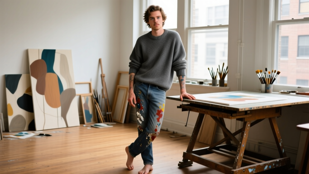
Instead, the visual language is rooted in documentary-style street photography and studio chaos. The feed is populated with blurry flash photography, concrete textures, paint-stained hands, skateboarding culture, and candid moments in the studio. This creates a cohesive ‘visual thesis’ that communicates authenticity. In the contemporary art world, credibility is often tied to a sense of rawness and rebellion against commercial polish. By treating his Instagram grid not as a billboard, but as an extension of his canvas, he attracts an audience that values artistic integrity over celebrity gossip. The follower engagement reflects this; comments are often focused on the texture of a painting or the composition of a photograph, rather than his lineage.
Deconstructing the Bio: The Power of the Anti-Bio
Perhaps the most fascinating element of his profile is the biography section itself. For a personal branding site like lovemebio.com, we often preach the importance of a clear, keyword-rich bio with a strong call-to-action. However, high-level visual artists frequently employ the ‘Anti-Bio’ strategy, and this profile is a masterclass in its execution.
Frequently, his Instagram bio is left entirely blank, or it features nothing more than a single cryptic emoji, a location pin for London, or a vague artistic reference. There is no Linktree. There is no ‘Shop my prints’ call-to-action. There is no management contact email listed in the bio text. Why? Because in the upper echelons of the art world, mystique is a currency. An empty or highly minimalist bio signals that the user is not desperate for engagement, brand deals, or external validation. It forces the viewer to scroll down and let the visual archive do the talking. The absence of a traditional bio creates an editorial, gallery-like atmosphere, transforming the profile from a social network page into a digital exhibition space.
Personal Branding Takeaways for Aspiring Artists
What can everyday users, freelance creatives, and aspiring artists learn from this unconventional approach to digital branding? Here are the core takeaways you can apply to your own profiles:
1. The Pseudonym Strategy for Compartmentalization
If you are trying to pivot from a known identity (whether that is a previous career, a family reputation, or a different creative niche), consider adopting a professional alias. Using a pseudonym allows you to build a brand that is entirely your own. It creates a psychological boundary between your personal life and your professional output, allowing your audience to judge your work without preconceived biases.
2. Curate a Visual Thesis, Not a Highlight Reel
Stop treating your grid like a scrapbook of random life updates and start treating it like a curated gallery. Decide on a visual thesis—whether that is moody architectural photography, bright digital illustrations, or raw film textures—and stick to it. You do not need to show your face in every post. Let your process, your environment, and your textures tell the story of who you are as a creator.
3. Leverage the Zero-Link Bio for Editorial Mystique
If your primary goal is to be seen as a high-end creative, an artist, or a luxury brand, strip away the clutter in your bio. Remove the emojis, the hashtags, and the aggressive sales pitches. A minimalist bio (e.g., just your city and your medium: ‘Oil on Canvas. London.’) projects confidence. It tells the audience that you are so secure in your visual portfolio that you do not need to shout at them from the top of the page.
Real-World Branding Lessons from the Ritchie Archive
The overarching lesson from this digital footprint is the power of intentional friction. In an era where algorithms reward constant, polished, and highly optimized content, choosing to be raw, sporadic, and visually challenging is a massive differentiator. By utilizing the private/public toggle on Instagram, occasionally locking his account to maintain privacy, and refusing to play the influencer game, he has maintained an aura of exclusivity. For creatives looking to build a personal brand that commands respect rather than just attention, the strategy is clear: protect your mystique, let your work dominate the grid, and allow your bio to be the quiet frame around a loud masterpiece.