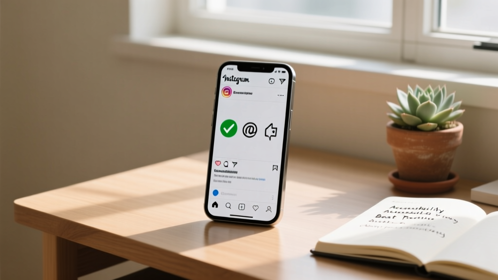

Instagram is widely known as a highly visual platform, driven by stunning photography, engaging reels, and dynamic stories. However, beneath the visual surface lies a critical text-based component that serves as your digital handshake: the Instagram bio. With a strict 150-character limit, every single letter, symbol, and emoji counts. But while you might be focused on aesthetics and clever wordplay, there is a crucial element that many creators and businesses overlook: accessibility.
Instagram bio accessibility ensures that your profile introduction is perceivable, understandable, and navigable for all users, including those who rely on assistive technologies like screen readers or screen magnifiers. When your bio is inaccessible, you inadvertently alienate a significant portion of your potential audience. In this comprehensive guide, we will explore the mechanics of digital accessibility, why it matters for your personal or brand profile, and how to optimize your bio so that it welcomes everyone.
What Is Instagram Bio Accessibility?
Digital accessibility is the practice of designing and developing content so that people with disabilities can use it effectively. In the context of an Instagram bio, accessibility means structuring your 150 characters so that they make sense when read aloud by a screen reader, remain legible when magnified, and are easy to comprehend for users with cognitive disabilities.
An accessible bio avoids common pitfalls like custom Unicode fonts, emoji spam, and confusing formatting. Instead, it relies on standard text, thoughtful punctuation, and clear language. When you prioritize accessibility, you are not just checking a compliance box; you are practicing digital empathy and ensuring that your message reaches the widest possible audience.
Why Inclusivity in Your Bio Matters
You might wonder why spending time on accessibility for a mere 150 characters is worth the effort. The reasons span ethical, practical, and business-oriented benefits:
- Audience Reach: Over one billion people worldwide live with some form of disability. By making your bio accessible, you ensure that millions of potential followers, customers, or collaborators can actually read and understand who you are.
- Brand Reputation: Modern consumers value inclusivity. Brands and creators who actively practice digital accessibility are viewed as more empathetic, professional, and socially responsible.
- Algorithmic & SEO Benefits: While Instagram is a social platform, its search functionality relies heavily on text parsing. Standard, accessible text is easily indexed by Instagram’s internal search algorithms, whereas obscure Unicode symbols are often ignored or misinterpreted.
- Legal & Ethical Standards: As digital accessibility laws and guidelines (such as the WCAG) become more prominent globally, maintaining accessible social media profiles is becoming a standard best practice for businesses and public figures.
If you are looking for inspiration to craft a bio that is both engaging and inclusive, browsing our Instagram bio ideas library can provide excellent starting points that prioritize clean, readable text.
How Screen Readers Navigate Instagram
To understand how to write an accessible bio, you must first understand how assistive technology interacts with the Instagram interface. Users who are blind or have low vision often rely on screen readers like Apple’s VoiceOver, Android’s TalkBack, or desktop tools like NVDA and JAWS.
When a screen reader user lands on your profile, the software reads the elements in a specific order:
- The profile picture (and its associated alt text, if provided).
- The username (handle).
- The Name field (the bold text at the top of the bio).
- The bio text itself.
- The external link (Link-in-bio).
If your bio text contains non-standard characters, the screen reader will attempt to read the underlying code of those characters rather than the visual representation. This can result in a confusing, frustrating, and lengthy audio experience that causes the user to swipe away from your profile immediately.
The Danger of Custom Fonts (Unicode)
The most common accessibility violation in Instagram bios is the use of custom fonts. Many users turn to third-party apps and websites to generate stylish text, such as cursive, bold, or typewriter fonts. However, Instagram does not natively support font changes. These third-party tools achieve the visual effect by swapping standard alphabet letters for Unicode mathematical symbols or other obscure character sets.
How Screen Readers Interpret Unicode
While a sighted user sees a beautiful cursive word like “Hello,” a screen reader reads the literal Unicode description of every single character. For example, if you use a mathematical bold script font, the screen reader will announce:
“Mathematical bold script capital H, mathematical bold script small e, mathematical bold script small l, mathematical bold script small l, mathematical bold script small o.”
Imagine listening to that description for a 150-character bio. It is exhausting, confusing, and entirely defeats the purpose of a quick introduction. Furthermore, users who rely on braille displays will receive a jumble of mathematical braille symbols that do not translate into readable text.
The Verdict on Custom Fonts
To maintain an accessible Instagram bio, never use custom Unicode fonts. Stick to the standard, native text provided by the Instagram app. If you want to emphasize a word, use standard capitalization or place it between asterisks (e.g., *IMPORTANT*) which screen readers can interpret as emphasis.
Emoji Accessibility: Less Is More
Emojis are a staple of social media communication, adding personality, color, and emotion to a limited character count. However, they must be used strategically to maintain accessibility.
How Screen Readers Handle Emojis
Every emoji has an official, often lengthy, text description programmed into operating systems. For instance, the standard smiling face with sunglasses emoji is read aloud as “Smiling face with sunglasses.” If you use a string of five identical emojis to create a visual border in your bio, the screen reader will repeat that long phrase five times.
Best Practices for Emoji Usage
- Limit Your Quantity: Use emojis sparingly. One or two well-placed emojis can convey your brand vibe without overwhelming the audio output of a screen reader.
- Placement Matters: Place emojis at the end of a sentence or line, rather than in the middle. Placing an emoji between words interrupts the natural flow of speech synthesized by the screen reader, making the sentence difficult to comprehend.
- Avoid Emojis as Bullet Points: While visually appealing, using emojis as bullet points for a list means the screen reader will read the emoji description before every single list item. Instead, use standard hyphens (-) or asterisks (*) for lists.
- Be Mindful of Skin Tone Modifiers: Screen readers will announce the skin tone modifier (e.g., “Waving hand, medium-dark skin tone”). Ensure your choices are intentional and respectful.
The Power of CamelCase for Hashtags & Handles
Hashtags and @mentions are vital for discoverability and networking on Instagram. However, how you format them drastically impacts readability for both screen readers and individuals with cognitive disabilities like dyslexia.
What Is CamelCase?
CamelCase (or PascalCase) is the practice of capitalizing the first letter of every word in a multi-word hashtag or handle.
Inaccessible: #socialmediamarketingtips
Accessible: #SocialMediaMarketingTips
Why CamelCase is Essential
Screen readers rely on capitalization cues to determine where one word ends and the next begins. If a hashtag is entirely lowercase, the screen reader may attempt to read it as a single, unrecognizable word, resulting in gibberish audio. By capitalizing the first letter of each word, you force the screen reader to pronounce each word distinctly.
Additionally, CamelCase significantly reduces the cognitive load for neurodivergent users and those with reading difficulties. The capital letters act as visual anchors, breaking up long strings of text into digestible chunks. This simple habit makes your bio, captions, and comments infinitely more accessible.
Structuring Your Bio for Audio Comprehension
Because you only have 150 characters, it is tempting to use shorthand, obscure abbreviations, or symbols to save space. However, accessible writing prioritizes clarity over extreme brevity.
Punctuation & Line Breaks
Screen readers use punctuation to determine pacing and intonation. A period indicates a full stop, while a comma indicates a brief pause. If you omit punctuation to save characters, the screen reader will read your entire bio as one long, breathless run-on sentence.
Use standard line breaks (the return key) to separate different thoughts or pieces of information. Screen readers will usually pause slightly at line breaks, helping the user mentally organize the information you are presenting (e.g., separating your job title from your location).
Avoiding Obscure Symbols
Many users use special Unicode arrows, stars, or dividers to separate lines in their bio. Just like custom fonts, these symbols are read aloud by their technical names (e.g., “Black right-pointing double triangle with vertical bar”). Stick to standard keyboard characters like the pipe symbol (|), standard hyphens (-), or simple colons (:) to separate information cleanly.
Cognitive Accessibility & Plain Language
Accessibility is not solely about visual or auditory impairments; it also encompasses cognitive accessibility. Users with learning disabilities, attention deficit disorders, or those who are reading in their second language benefit immensely from plain, straightforward language.
- Avoid Jargon: Unless your niche strictly requires it, avoid hyper-specific industry jargon that might confuse new visitors.
- Clear Value Proposition: State exactly what you do or who you are in simple terms. “I help small businesses grow through SEO” is vastly more accessible than “Synergizing digital paradigms for B2B growth hacking.”
- Consistent Formatting: Keep your formatting predictable. If you use a hyphen to separate your title from your location on one line, use the same structure on subsequent lines.
If you find yourself struggling to distill your complex business model into clear, accessible language, our Instagram bio generator can help you brainstorm concise, easy-to-read options that fit perfectly within the character limit.
Visual Impairments Beyond Screen Readers
Not all visually impaired users rely on screen readers. Many individuals with low vision use screen magnifiers or rely on high-contrast displays to read text on their mobile devices.
The Problem with Tight Spacing
When users zoom in on their screens to read your bio, tight spacing and lack of line breaks can cause text to wrap awkwardly or become cut off at the edges of the screen. Using the return key to create distinct lines of text ensures that when a user magnifies your profile, they can scroll vertically through your bio without losing their place.
Profile Picture Contrast
While technically outside the 150-character bio text, your profile picture sits directly above your bio and is a vital part of your profile’s accessibility. Ensure your profile picture has high contrast and a clear focal point. Avoid busy backgrounds that make it difficult for low-vision users to identify who or what the image represents.
Optimizing Your Link-in-Bio
The link in your bio is often the primary call-to-action (CTA) for your profile. How you introduce this link in your bio text is crucial for accessibility.
Descriptive Link Text
Do not assume the user knows what the link is for. Instead of writing “Click below” or “Link ↓”, use your bio characters to describe the destination.
Inaccessible: New video out now! Link ↓
Accessible: Watch my latest tutorial on accessible design at the link below.
Furthermore, if you use a link-aggregation service like Linktree, Beacons, or Carrd, ensure that the links inside that landing page are also accessible. Use descriptive text for your buttons (e.g., “Read the Blog” instead of “Click Here”) and ensure the landing page has sufficient color contrast and keyboard navigability.
Step-by-Step: How to Audit Your Current Bio
Ready to make your profile inclusive? Follow this step-by-step audit to test your current Instagram bio for accessibility.
- Enable VoiceOver or TalkBack: Turn on your smartphone’s native screen reader. (On iOS, go to Settings > Accessibility > VoiceOver. On Android, go to Settings > Accessibility > TalkBack). Navigate to your profile and listen to how your bio is read aloud.
- Check for Unicode: If the screen reader announces “mathematical,” “symbol,” or “regional indicator,” you are using custom fonts or special characters. Delete them and replace them with standard keyboard text.
- Count Your Emojis: Listen to the emoji descriptions. If the audio output feels repetitive or cluttered, remove excess emojis and keep only the most essential ones at the ends of your lines.
- Verify CamelCase: Check your hashtags and @mentions. Ensure the first letter of every distinct word is capitalized.
- Test the Magnifier: Use your phone’s zoom accessibility feature to magnify your bio. Ensure the line breaks make sense and the text is easy to track horizontally and vertically.
Examples of Accessible vs. Inaccessible Bios
Let’s look at some practical examples to illustrate the difference between an inaccessible bio and an optimized, inclusive one.
Example 1: The Lifestyle Creator
Inaccessible:
𝓜𝓘𝓥𝓢𝓨𝓧𝓜𝓙𝓘 𝓛𝓢𝓗𝓧𝓘𝓡𝓧 ✨
🌿 𝓕𝓢𝓠𝓘𝓦𝓧𝓘𝓚𝓘𝓥 & 𝓛𝓘𝓥𝓕𝓔𝓙𝓢𝓨𝓡𝓗 🌿
👇👇👇 𝓡𝓘𝓤 𝓛𝓘𝓥𝓕𝓔𝓙𝓔𝓧𝓢𝓨𝓧 👇👇👇
Screen Reader Output: “Mathematical bold script capital L, mathematical bold script small i... [repeats for every letter]. Black right-pointing double triangle...”
Accessible:
Lifestyle content creator.
Sharing herbal remedies & foraging tips.
Shop my new herbal tea blend below.
Screen Reader Output: “Lifestyle content creator. Sharing herbal remedies and foraging tips. Shop my new herbal tea blend below.” (Clean, concise, and perfectly understandable).
Example 2: The Small Business
Inaccessible:
#handmadejewelry #smallbusinessowner
★ custom orders open ★
linkin.bio/shop
Accessible:
Handmade silver jewelry.
Custom orders are currently open.
#HandmadeJewelry #SmallBusiness
Browse the shop at the link below.
Notice how the accessible version uses CamelCase for the hashtags, standard punctuation, and a clear, descriptive call-to-action for the link. For more tailored examples for specific niches, explore our business bio ideas collection.
Frequently Asked Questions (FAQ)
Can I use any emojis in an accessible bio?
Yes, you can use emojis, but they should be used intentionally and sparingly. Avoid using emojis as replacements for words (e.g., using a 📍 instead of writing “Location:”), as screen readers will only read the emoji description, which might not provide enough context. Always place emojis at the end of a sentence or line to avoid disrupting the audio flow.
Are custom fonts ever okay for accessibility?
No. Custom fonts generated by third-party apps rely on Unicode mathematical symbols and obscure character sets. These are fundamentally inaccessible to screen readers, braille displays, and custom text-styling browser extensions used by people with dyslexia. Always use the native, standard text provided by Instagram.
How do I add alt text to my Instagram profile picture?
Instagram allows you to edit the alt text of your posts, but native alt text editing for the main profile picture is limited and often defaults to your username. To ensure your profile picture is as accessible as possible, use a clear, high-contrast image, and ensure your Name field (the bold text right below your picture) clearly describes who you are or what your brand represents.
Does making my bio accessible hurt my aesthetic?
Not at all. Accessibility and aesthetics are not mutually exclusive. A clean, well-formatted bio with standard text, thoughtful line breaks, and minimal emojis often looks more professional and trustworthy than a cluttered bio filled with chaotic symbols and unreadable fonts. True aesthetic appeal includes clarity and ease of use.
Where can I find accessible bio templates?
You can find hundreds of clean, readable, and accessible templates by visiting our Instagram bio ideas hub. Whether you need a bio for a personal blog, a corporate page, or a creative portfolio, our templates are designed with standard text and clear formatting to ensure they are inclusive for all users.
What is the most important rule of Instagram accessibility?
The golden rule is to test your content with assistive technology. Turn on VoiceOver or TalkBack on your phone and listen to your profile. If the audio output is confusing, repetitive, or nonsensical to you, it will be equally frustrating for a user who relies on that technology every day to navigate the internet.
Conclusion
Creating an accessible Instagram bio is a small effort that yields a massive impact. By abandoning custom Unicode fonts, using emojis with intention, capitalizing hashtags, and writing clear, descriptive calls-to-action, you transform your profile from an exclusive visual club into a welcoming digital space for everyone.
Accessibility is not a trend; it is a fundamental aspect of modern digital communication. As you refine your social media strategy, remember that the most successful creators and brands are those that remove barriers to entry. Take a few minutes today to audit your profile using the steps outlined in this guide. If you need help drafting clean, effective text, utilize our Instagram bio generator to create a bio that truly represents you while remaining accessible to the world.