The Visual Psychology of Emojis in Bios
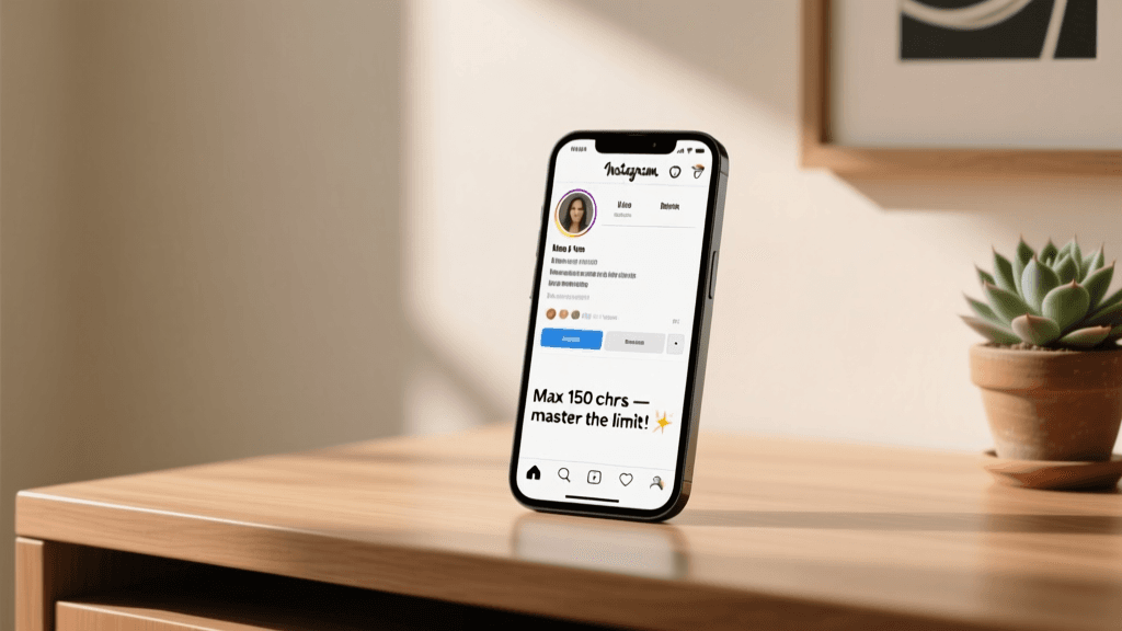
Your Instagram bio has roughly 150 characters to make a lasting impression. In that tiny window, emojis do heavy lifting that words alone simply cannot. Research from the University of Missouri found that emojis activate the same areas of the brain that process facial expressions, which means a well-placed smiley face literally triggers an emotional response in the person reading your profile.
Think about it: when someone lands on your Instagram profile, they scan your bio in roughly three to five seconds. During that brief window, emojis serve as visual anchors that guide the eye and communicate tone instantly. A camera emoji tells visitors you are a photographer faster than the word "photographer" ever could. A globe signals international reach. A fire emoji conveys energy and excitement without saying a single word.
But the psychology goes deeper than simple recognition. Emojis create what cognitive scientists call "processing fluency" — they make your bio easier and faster to read, which in turn makes people feel more positively about your brand. A bio that is visually easy to scan feels more professional and trustworthy than a dense block of plain text, even if the underlying words are identical.
The key insight is that emojis are not decorative afterthoughts. They are strategic communication tools that compress meaning, convey personality, and guide visual flow. The profiles that perform best on Instagram treat emojis the way great designers treat icons: every single one is placed with intention.
Before you start adding emojis randomly, consider your audience. A financial advisor targeting retirees will use emojis very differently than a streetwear brand targeting Gen Z. The emoji choices you make signal who you are and who your content is for. Getting this right is one of the fastest ways to improve your bio's effectiveness, and you can preview different emoji combinations using our Font Generator tool before committing to changes.
Emoji Placement Strategies
Where you place emojis in your bio matters just as much as which emojis you choose. There are several proven placement strategies that professional social media managers use consistently, and understanding each one will give you much more control over how your profile reads.
The Bullet Point Method
This is the most popular strategy for good reason. Instead of using traditional bullet points, you place a relevant emoji at the start of each line in your bio. This creates a clean, scannable list that is easy to read on mobile devices where most Instagram browsing happens.
Here is an example structure:
- Camera emoji followed by your photography niche
- Location pin emoji followed by your city or service area
- Envelope emoji followed by contact information
- Link emoji or arrow emoji pointing down toward your link in bio
The bullet point method works because it imposes visual structure on a space that does not support traditional formatting. Each emoji acts as a section marker that helps readers find the information they care about most.
The Bookend Strategy
This approach places matching or complementary emojis at the beginning and end of your bio, creating a visual frame. For example, starting with a sparkle emoji and ending with a sparkle emoji gives your entire bio a polished, designed feeling. This works especially well for lifestyle brands, beauty influencers, and creative professionals who want their profile to feel curated.
The Accent Approach
Instead of using emojis on every line, you use them sparingly as accents next to your most important information. Maybe you only use two or three emojis total, but each one highlights something critical: your specialty, your call-to-action, or your location. This minimalist approach appeals to audiences who associate heavy emoji use with unprofessionalism.
The Emoji Separator
Some of the most visually striking bios use a row of emojis as a horizontal divider between sections. Three to five emojis in a row — like stars, dots, or diamonds — create a visual break that separates your introduction from your call-to-action. This technique is particularly effective if you have multiple messages to communicate and need to create clear visual sections.
Regardless of which strategy you choose, consistency is critical. If you start with emoji bullet points, use them on every line. If you use the bookend approach, make sure both ends match. Inconsistent emoji use looks sloppy and undermines the professional impression you are trying to create. For more inspiration on different styles, browse our aesthetic bio ideas collection to see how top creators use emojis effectively.
How Line Breaks and Spacing Work
Line breaks are one of the most misunderstood elements of Instagram bio formatting. Many people write a beautifully formatted bio with clean line breaks, hit save, and then watch in frustration as Instagram squashes everything into a single, unreadable block of text. Understanding how line breaks actually work will save you hours of frustration and help you create a bio that looks polished on every device.
The Line Break Problem
Instagram's bio field does not always preserve line breaks that you type directly into the app. This is especially true on certain devices and app versions. You might carefully format your bio with clean paragraph breaks, only to find that Instagram strips them out when you save. This happens because Instagram sometimes treats the bio field as a single-line text input, collapsing whitespace the same way HTML collapses spaces in a browser.
Solutions That Actually Work
The most reliable method for preserving line breaks is to write your bio in a notes app first, with all the line breaks exactly where you want them, and then copy and paste the entire thing into Instagram. The Notes app on iOS and Google Keep on Android both preserve formatting well when pasted into Instagram's bio field.
Another approach that many professionals use is the invisible character method. By placing a special invisible Unicode character at the end of each line, you force Instagram to recognize the line break. These invisible characters take up zero visual space but tell Instagram's text renderer that the line has ended. Our invisible character tool generates these characters for easy copying.
Spacing for Readability
Beyond line breaks, the amount of vertical space between elements affects readability. A bio with generous spacing between lines feels open and inviting, while a bio crammed with text feels claustrophobic. Since Instagram does not let you add extra line breaks beyond what the text provides, you need to make every line count.
Keep each line to a single idea or piece of information. Resist the urge to pack multiple messages onto one line just to save characters. If you need to communicate five things, use five lines. Short, punchy lines are easier to scan and more likely to be read in full.
Character Count Awareness
Remember that every emoji counts as one or two characters toward your 150-character limit. Some emojis, particularly those with skin tone modifiers or compound emojis, can consume two characters. This means you need to budget your characters carefully, balancing the visual impact of emojis against the information your words convey. Use a character counter to check your bio length before publishing.
Using Unicode Font Styles Safely
If you have spent any time exploring Instagram bios, you have probably seen profiles that use fancy text styles — cursive letters, bold serif fonts, typewriter-style monospace text, or even upside-down letters. These are not actual fonts rendered by Instagram. They are Unicode characters that look like styled text, and they can make your bio stand out dramatically from the crowd.
How Unicode Font Styles Work
Unicode is the international standard for encoding text, and it contains thousands of characters that look like styled versions of regular letters. Mathematical Alphanumeric Symbols, for instance, include bold, italic, bold-italic, script, and monospace variants of the Latin alphabet. When you copy these characters into your Instagram bio, Instagram displays them as-is because they are legitimate Unicode characters, not formatting commands.
This means you can make your name appear in elegant script, your tagline in bold serif, or your contact info in clean monospace — all without any special tools or code. Our Instagram font generator lets you type any text and instantly see it converted into dozens of Unicode font styles.
Popular Font Styles for Bios
The most commonly used Unicode font styles in Instagram bios include:
- Script and cursive styles: These create an elegant, feminine, or artistic feel. They work well for beauty influencers, wedding photographers, fashion brands, and lifestyle bloggers.
- Bold serif styles: These convey authority and professionalism. They are popular among business coaches, consultants, and established brands.
- Monospace and typewriter styles: These give a minimalist, tech-savvy, or retro aesthetic. They work well for developers, designers, and digital artists.
- Small caps: These create a clean, sophisticated look that works across almost any niche. They are subtle enough to maintain readability while still standing out.
- Bubble and circle text: These are playful and eye-catching, popular among younger creators and entertainment-focused accounts.
The Accessibility Warning
Here is something that most articles about Instagram fonts will not tell you: Unicode font styles are invisible to screen readers. When a visually impaired person visits your profile using a screen reader, those fancy cursive letters will be read as mathematical symbols or completely unrecognizable character descriptions. This means your carefully crafted bio becomes gibberish for anyone relying on assistive technology.
The best practice is to use Unicode font styles for decorative elements only, never for critical information. Your name, your primary call-to-action, and your contact information should always be in standard text that screen readers can interpret. Use fancy fonts for accent words, dividers, or aesthetic flourishes, but keep the essential parts of your bio accessible.
Device Compatibility
Not all Unicode characters render correctly on every device. Older Android phones, in particular, may display certain mathematical symbols as empty boxes or question marks. Before committing to a specific font style, test how it looks on at least two different devices. If you see boxes or question marks, try a different style that has broader compatibility.
Formatting Mistakes That Hurt Your Bio
Even with the best intentions, formatting mistakes can make your bio look unprofessional and hurt your credibility. These are the most common formatting errors that we see, along with specific fixes for each one.
Emoji Overload
Using too many emojis is the number one formatting mistake on Instagram. When every line has three or four emojis, your bio starts to look like a slot machine. The visual noise makes it hard to focus on any single piece of information, and the overall impression is chaotic rather than engaging. As a general rule, limit yourself to one emoji per line when using the bullet point method, or three to five emojis total when using the accent approach.
Inconsistent Formatting
Nothing screams "amateur" louder than a bio that switches formatting styles mid-stream. If you start with emoji bullet points, do not switch to plain text halfway through. If you use a specific font style for one line, apply it consistently or not at all. Inconsistency suggests you did not put thought into your bio, which makes visitors question whether you put thought into your content.
Broken Line Breaks
A bio that was clearly meant to have line breaks but displays as a single block of text looks careless. This usually happens when someone types their bio directly into the Instagram app without testing how it displays. Always preview your bio after saving to make sure the formatting survived. If it did not, use the copy-paste method from a notes app or add invisible characters as described earlier.
Unreadable Font Choices
Some Unicode font styles look beautiful but are nearly impossible to read at small sizes. Extremely ornate script fonts, heavily decorated letters, and upside-down text all sacrifice readability for novelty. Remember that most people will view your bio on a phone screen that is roughly six inches wide. If they have to squint or tilt their head to read your bio, you have lost them.
Ignoring Mobile Preview
Your bio might look perfect on a desktop browser but completely different on a mobile device. Line lengths change, emoji sizes vary, and spacing behaves differently across platforms. Always check your bio on a phone before finalizing it. Ask a friend to screenshot their view of your profile so you can see exactly what visitors experience.
Fixing these mistakes takes just a few minutes, but the impact on your profile's first impression is significant. If you want a quick way to see how different formatting options look, our bio preview tool shows you a real-time mockup of your Instagram profile as you type.
Frequently Asked Questions
How many emojis should I use in my Instagram bio?
Most professional social media managers recommend between three and seven emojis for a standard Instagram bio. The exact number depends on your formatting strategy. If you are using emojis as bullet points, one per line across four to five lines is ideal. If you are using them as accents, two or three strategically placed emojis create a clean look. The key is intentionality — every emoji should serve a purpose, whether that is communicating information, guiding the eye, or establishing tone. Random emoji placement always looks worse than a deliberate, structured approach.
Will Unicode font styles get my account shadowbanned?
No, using Unicode font styles in your bio will not cause a shadowban. These characters are part of the standard Unicode specification and Instagram does not penalize accounts for using them. However, there is a practical concern: if Instagram's spam detection systems encounter text that looks obfuscated or machine-generated, there is a small chance it could trigger additional scrutiny. To stay safe, use Unicode font styles for decorative purposes and keep the majority of your bio in standard text. Never use fancy fonts to try to circumvent content policies or hide keywords.
Why do my line breaks disappear when I save my Instagram bio?
This happens because Instagram's bio text field does not consistently preserve newline characters entered directly in the app. The most reliable fix is to write your bio in a separate notes application with all your desired line breaks, then copy and paste the complete text into Instagram. Alternatively, you can add an invisible Unicode character at the end of each line to force Instagram to recognize the break. Both methods work well, though the invisible character method is more reliable across different app versions and devices.
Do fancy fonts in my bio affect Instagram search and discoverability?
Unicode font styles in your bio do not affect your discoverability through Instagram search. Instagram's search algorithm primarily indexes your username, name field, and bio text for keyword matching. However, Unicode characters may not be indexed the same way as standard characters, which means keywords written in fancy fonts might not contribute to search relevance. For maximum discoverability, keep your most important keywords — your niche, your location, your specialty — in standard text and reserve decorative fonts for less critical elements.
What is the best way to test how my bio formatting looks on different devices?
The most thorough approach is to update your bio, then check your profile on at least three devices: an iPhone, an Android phone, and a desktop browser. Ask friends or colleagues to screenshot what they see on their devices, since rendering can vary by operating system version and Instagram app version. Pay attention to whether line breaks survive, whether all emojis render correctly, and whether any Unicode font styles display as empty boxes. If you notice issues on any device, adjust your formatting and test again until the bio looks acceptable across all platforms.