The Hidden Barrier of Instagram Bios
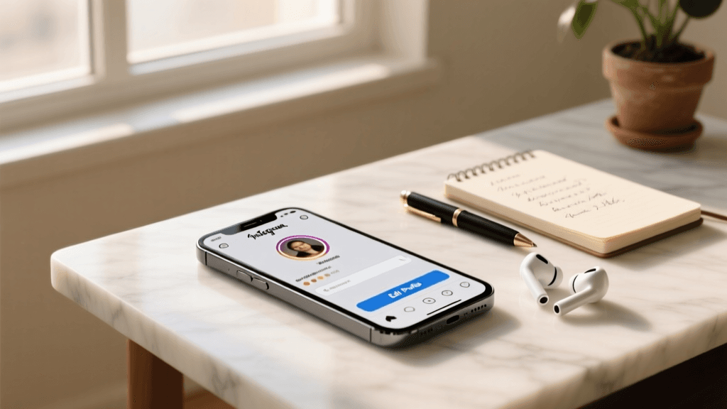
When crafting the perfect Instagram profile, most users focus on aesthetics, keywords, and brand alignment. However, a critical element is often overlooked: accessibility. Instagram is a highly visual platform, but millions of users rely on screen readers like VoiceOver and TalkBack to navigate the app. If your bio relies on custom fonts, complex symbols, or poorly placed emojis, you are inadvertently locking out a significant portion of your audience. This comprehensive guide approaches accessibility from a practical, actionable perspective, providing you with a complete Template and Copy-Paste Library to ensure your profile is inclusive, professional, and optimized for all users.
Creating an accessible bio does not mean sacrificing your personal brand or visual appeal. In fact, accessible bios tend to be cleaner, more organized, and easier for everyone to read, regardless of whether they use assistive technology. By utilizing screen-reader friendly dividers, predictable bullet points, and structured templates, you can build a profile that welcomes every visitor. Below, we will explore the mechanics of screen readers, provide a massive library of safe copy-paste symbols, and offer ready-to-use templates for every niche.
How Screen Readers Interpret Your Profile
To understand why certain design choices fail, you must first understand how assistive technology works. Screen readers parse text linearly, reading aloud every character, space, and symbol. When you use a third-party app to generate 'fancy fonts' (which are actually mathematical alphanumeric symbols), the screen reader does not see the word 'Hello'. Instead, it reads out the literal Unicode description of each character, resulting in a confusing audio experience like: 'Mathematical bold capital H, mathematical bold small e, mathematical bold small l...' This completely destroys the user experience and obscures your core message.
Furthermore, screen readers rely on proper spacing and punctuation to determine when to pause or change inflection. A bio that is just a string of emojis and unspaced hashtags will be read as a single, breathless, and incomprehensible audio block. By utilizing standard text, proper capitalization, and accessible punctuation from our copy-paste library, you ensure that your bio sounds exactly how you intend it to be heard.
The Copy-Paste Library: Safe Symbols and Dividers
Not all symbols are created equal. While some decorative kaomoji and complex ASCII art are read as gibberish, standard Unicode symbols are recognized and pronounced clearly by screen readers. Below is your ultimate copy-paste library, categorized by function, complete with exactly how a screen reader will announce them.
Category 1: Screen-Reader Friendly Dividers
Dividers are essential for breaking up your bio into digestible chunks. Instead of using long strings of tildes or obscure decorative lines, use these clean, accessible alternatives.
- | (Vertical Pipe): Read as 'Vertical bar' or 'Pipe'. Excellent for separating distinct roles or locations (e.g., 'Writer | Traveler').
- • (Bullet): Read as 'Bullet'. The gold standard for creating clean, accessible lists without triggering formatting errors.
- - (Hyphen): Read as 'Dash' or 'Hyphen'. Great for simple, minimalist separation.
- / (Forward Slash): Read as 'Slash'. Perfect for indicating dual roles or alternatives (e.g., 'Designer / Developer').
- + (Plus Sign): Read as 'Plus'. Useful for showing collaborations or additions (e.g., 'Coffee + Code').
Category 2: Directional Arrows and CTA Pointers
When directing users to your link in bio, you need symbols that clearly indicate direction without causing audio clutter.
- ↓ (Downwards Arrow): Read as 'Downwards arrow'. The most accessible way to point to the link below.
- → (Rightwards Arrow): Read as 'Rightwards arrow'. Good for indicating a sequence or a next step.
- 👇 (Down Pointing Index): Read as 'White down pointing backhand index'. While the description is long, it is universally understood by screen reader users as a directional cue.
- 🔗 (Link Symbol): Read as 'Link symbol'. A highly accessible, literal representation of a URL or hyperlink.
Category 3: Emojis with Predictable Descriptions
Emojis can add personality, but their accessibility descriptions can sometimes be overly literal or confusing. Stick to these universally recognized emojis that translate well to audio.
- 📍 (Round Pushpin): Read as 'Round pushpin'. The standard, accessible way to denote a location.
- ✉️ (Envelope): Read as 'Envelope'. Clear and concise for indicating email or contact information.
- 🎙️ (Studio Microphone): Read as 'Studio microphone'. Perfect for podcasters and audio creators.
- 🛒 (Shopping Cart): Read as 'Shopping cart'. Universally understood for e-commerce and retail links.
- 📅 (Spiral Calendar): Read as 'Spiral calendar'. Ideal for event dates, booking links, or schedules.
Category 4: Symbols to Strictly Avoid
To maintain an inclusive profile, avoid copy-pasting the following elements, as they create severe audio clutter and confusion:
- Custom Font Generators: Never use mathematical alphanumeric symbols (e.g., 𝔉𝔞𝔫𝔠𝔶 𝔉𝔬𝔫𝔱𝔰).
- Complex Kaomoji: Avoid text faces like (◕‿◕) or ʕ•ᴥ•ʔ, which are read as a chaotic string of punctuation marks.
- Repetitive Decorative Strings: Avoid long lines of sparkles (✨✨✨✨✨) or stars, as the screen reader will repeat the word 'sparkles' five times in a row.
- Invisible Characters: Do not use blank Unicode characters to force line breaks, as some screen readers will announce them as 'unrecognized character' or 'blank'.
Accessible Bio Templates: Copy and Paste
Now that you have your library of safe symbols, it is time to put them into practice. Below are structured, accessible templates designed for various niches. Simply copy, paste, and customize the bracketed text. For more inspiration, you can also explore our extensive collections of minimalist bio ideas and aesthetic bio ideas, all of which prioritize clean, readable formatting.
1. The Accessible Minimalist
The minimalist approach is inherently accessible because it relies on standard text and ample spacing. This template uses the vertical pipe and standard bullet points to create a clean hierarchy.
Template:
[Name or Brand Identity]
[Profession] | [Secondary Skill]
• [Core Value or Mission Statement]
• [Notable Achievement or Hobby]
📍 [City, Country]
↓ [Call to Action]
Example:
Jane Doe
UX Designer | Researcher
• Designing for human behavior
• Speaker at DesignCon
📍 London, UK
↓ View my portfolio
2. The Inclusive Small Business
Small businesses need to convey trust, location, and a clear path to purchase. This template uses the envelope and shopping cart emojis to provide clear, audio-friendly context for the links and contact info.
Template:
[Business Name]
[Short, descriptive tagline about what you sell]
✉️ [Email Address] for inquiries
📍 [Physical Location or 'Shipping Worldwide']
🛒 Shop our latest collection below
↓ [Link Name]
Example:
Oak & Iron Ceramics
Handcrafted mugs and bowls for your daily ritual
✉️ hello@oakiron.com for custom orders
📍 Portland, OR
🛒 Shop our latest collection below
↓ Browse the store
3. The Screen-Reader Friendly Creator
Content creators often juggle multiple platforms and sponsorships. This template uses the forward slash and clear emojis to separate different facets of the creator's digital footprint without overwhelming the listener.
Template:
[Creator Name]
[Platform 1] / [Platform 2] / [Platform 3]
🎙️ Host of the [Podcast Name] podcast
📅 New videos every [Day of the week]
🔗 All my links and socials
↓ [Call to Action]
Example:
Alex Rivera
YouTube / TikTok / Twitch
🎙️ Host of the TechTalks podcast
📅 New videos every Tuesday
🔗 All my links and socials
↓ Grab my free editing preset
4. The Accessible Aesthetic
You can still have a visually pleasing, 'aesthetic' bio without resorting to unreadable fonts. The secret is using soft, standard punctuation and carefully selected, singular emojis. Check out more aesthetic bio ideas that balance beauty with accessibility.
Template:
[Name]
[Poetic or soft description of your niche]
- [Hobby or passion 1]
- [Hobby or passion 2]
📍 [Location]
→ [Link description]
Example:
Elara
Capturing quiet moments in a loud world
- Film photography
- Matcha enthusiast
📍 Kyoto
→ View my photo gallery
5. The Professional and Corporate Bio
For corporate pages or B2B professionals, clarity and authority are paramount. This template avoids emojis entirely, relying on standard text, hyphens, and professional formatting to convey expertise.
Template:
[Company Name]
[Industry] - [Core Service or Product]
Helping [Target Audience] achieve [Specific Result].
Founded in [Year].
Contact our team:
↓ [Link to Contact Page]
Example:
Apex Financial Solutions
Fintech - Wealth Management Software
Helping independent advisors scale their practices.
Founded in 2015.
Contact our team:
↓ Request a demo
Core Rules for Accessible Bio Formatting
Beyond the symbols and templates you use, the way you format your text plays a massive role in accessibility. Follow these core rules to ensure your bio is perfectly optimized for assistive technology.
CamelCase for Hashtags and Handles
When using hashtags or mentioning other accounts in your bio (if applicable), always use CamelCase. This means capitalizing the first letter of every word in the phrase. For example, use #SocialMediaMarketing instead of #socialmediamarketing. Screen readers rely on capital letters to identify word boundaries. If a hashtag is entirely lowercase, the screen reader may attempt to read it as a single, unrecognizable word, resulting in garbled audio. CamelCase ensures that the screen reader pronounces each word clearly and distinctly.
Strategic Emoji Placement
Emojis should be used as visual anchors, not as replacements for words. Never place an emoji in the middle of a sentence, as it will interrupt the audio flow and confuse the listener. For example, 'I love 📸 photography' will be read as 'I love camera with flash photography', which breaks the syntax. Instead, place emojis at the very beginning or the very end of a line. This allows the screen reader to finish the sentence and then announce the emoji as a supplementary piece of context.
Line Breaks and Spacing
Proper use of the return key is crucial. Screen readers use line breaks as natural pauses, similar to periods or commas. Ensure that each distinct thought or list item is on its own line. Avoid cramming multiple sentences into a single block of text. If you need extra space between sections, use a single blank line rather than relying on invisible characters or repetitive punctuation marks to force visual gaps.
How to Test Your Bio for Accessibility
The only way to truly know if your bio is accessible is to test it using the same tools your audience uses. Fortunately, both iOS and Android have built-in screen readers that you can activate in seconds.
Testing on iOS (VoiceOver): Go to Settings > Accessibility > VoiceOver and toggle it on. Navigate to your Instagram profile. Swipe right to move through the elements of your bio one by one. Listen carefully to how your name, bio text, and link are announced. If you hear a string of 'mathematical' terms or gibberish, you need to edit your bio.
Testing on Android (TalkBack): Go to Settings > Accessibility > TalkBack and turn it on. Open Instagram and use the swipe gestures to navigate your profile. Pay attention to the pacing and clarity of the audio output. Ensure that your dividers are providing helpful pauses rather than annoying audio clutter.
Tools for Building Inclusive Profiles
Writing an accessible bio from scratch can feel daunting, especially if you are trying to balance SEO keywords, character limits, and inclusive design. Fortunately, you do not have to do it alone. Our proprietary bio generator tool is built with accessibility in mind, ensuring that the suggestions it provides rely on standard, screen-reader friendly text and safe formatting structures.
If you want to dive deeper into the strategy behind your profile, our comprehensive guide on how to write an Instagram bio covers everything from keyword optimization to personal branding, all while maintaining a focus on inclusive design. Remember, an accessible bio is not just a nice-to-have; it is a fundamental aspect of modern digital marketing and personal branding.
Frequently Asked Questions (FAQ)
Are all emojis accessible?
Technically, all standard Unicode emojis have alt-text descriptions programmed into operating systems, meaning a screen reader will always announce something. However, not all emojis are practically accessible. Some emojis have overly long or confusing descriptions, and using them in the wrong context can disrupt the flow of information. Stick to universally recognized emojis that represent physical objects or clear actions, and avoid highly abstract or complex emoji combinations.
Can I use custom fonts if I add an accessible translation?
No. Even if you write your bio in a custom font and then provide a 'translation' in standard text below it, the screen reader will still read the custom font first, subjecting the user to a long, confusing audio experience before they reach the translation. Furthermore, custom fonts are not recognized by Instagram's search algorithm, meaning you will lose out on vital SEO discoverability. Always stick to standard system fonts.
Does accessibility affect Instagram SEO?
Yes, significantly. Instagram's search engine relies on parsing standard text to understand what your profile is about and categorize it for search results. Custom fonts and complex symbols are invisible to the search algorithm. By using standard, accessible text, you ensure that your keywords are properly indexed, making your profile more discoverable to all users, regardless of how they search.
What is the best link-in-bio tool for accessibility?
While your Instagram bio is important, the page it links to must also be accessible. When choosing a link-in-bio tool, look for platforms that support high color contrast, large tap targets, standard HTML heading structures, and alt-text for images. Avoid link-in-bio tools that rely heavily on complex JavaScript animations or lack keyboard navigation support, as these will create a barrier for users once they leave Instagram.
How often should I update my accessible bio?
You should review and update your bio whenever your core offering, location, or primary call-to-action changes. However, from an accessibility standpoint, it is wise to audit your bio at least twice a year. Operating systems update their screen reader dictionaries and emoji descriptions regularly. An emoji that had a concise description last year might have a longer, more literal description this year. Regular testing ensures your bio remains optimized for the latest assistive technologies.
Conclusion
Accessibility is not a constraint on your creativity; it is a framework that ensures your creativity reaches the widest possible audience. By utilizing the copy-paste libraries, safe symbols, and structured templates provided in this guide, you can craft an Instagram bio that is beautiful, functional, and inclusive. Remember that true aesthetic appeal lies in clarity, organization, and respect for the user experience. Embrace standard formatting, test your profile with screen readers, and watch as your inclusive approach builds a stronger, more engaged community around your brand.